Welcome to my studio

This intro film shares artwork from Emilia Valerio and imagery and film of them giving talks and introducing and sharing their artwork to audiences live and online.

Read more about Emilia Valerio

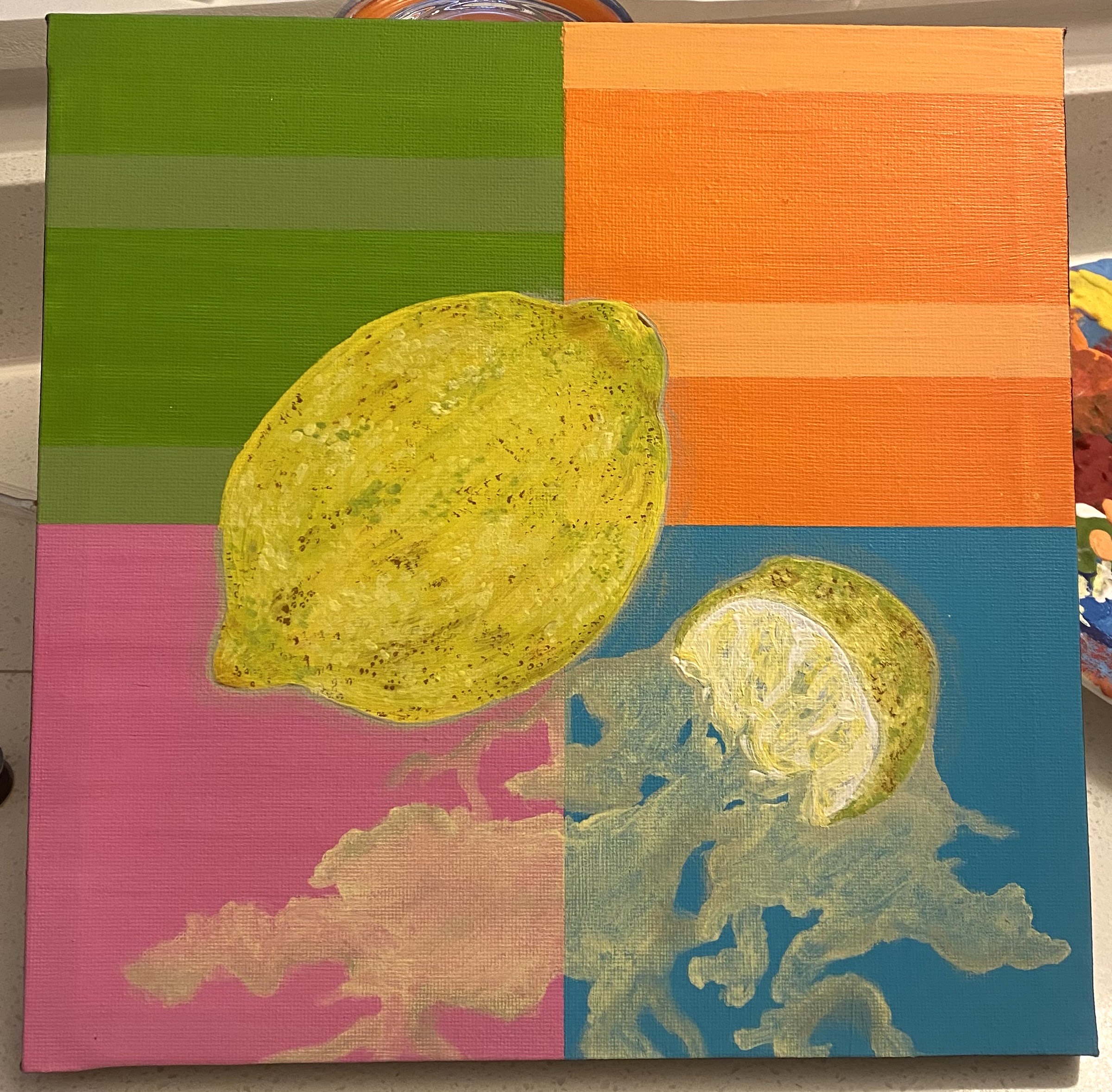
When Life Squeezes Lemons

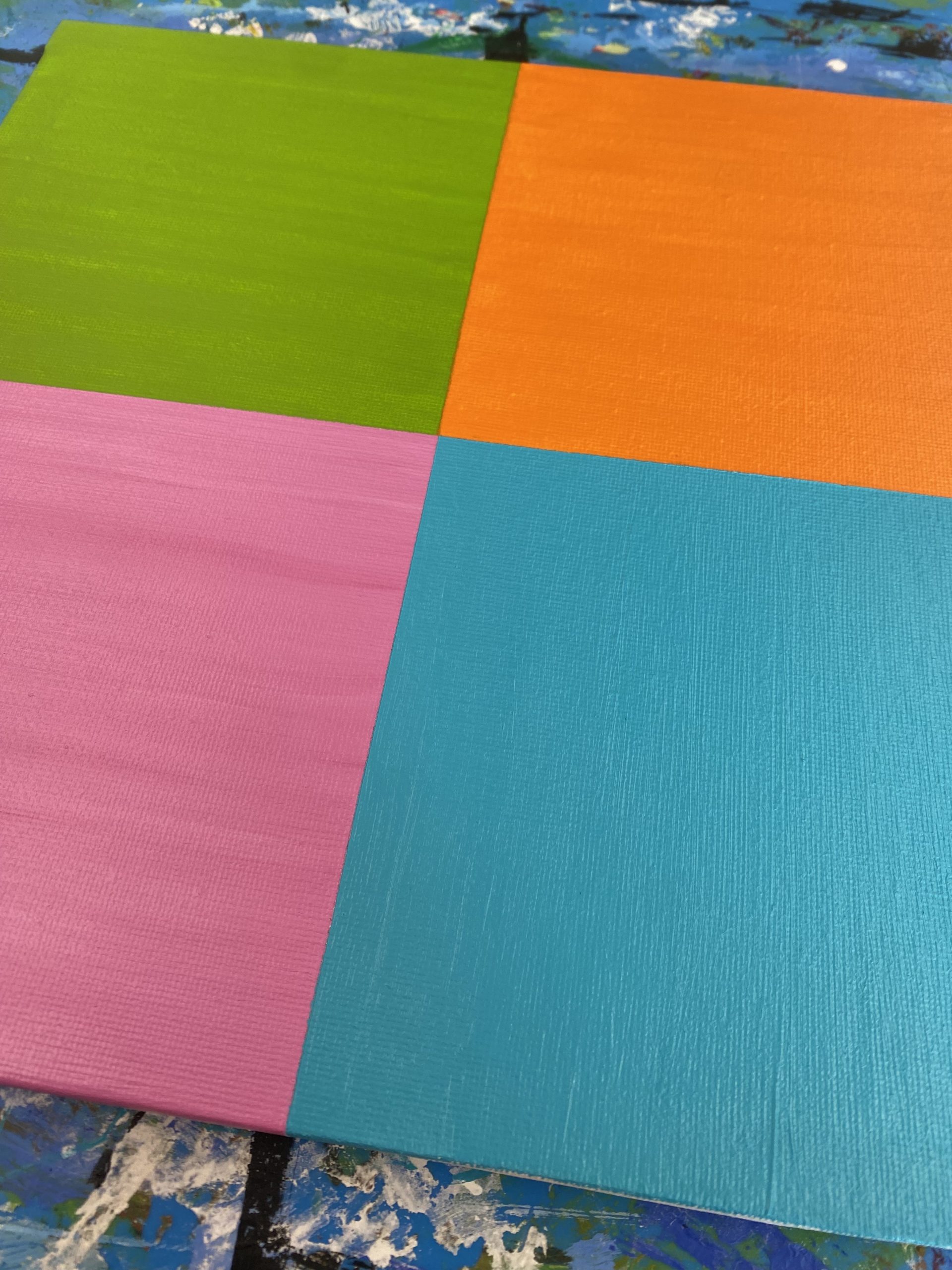
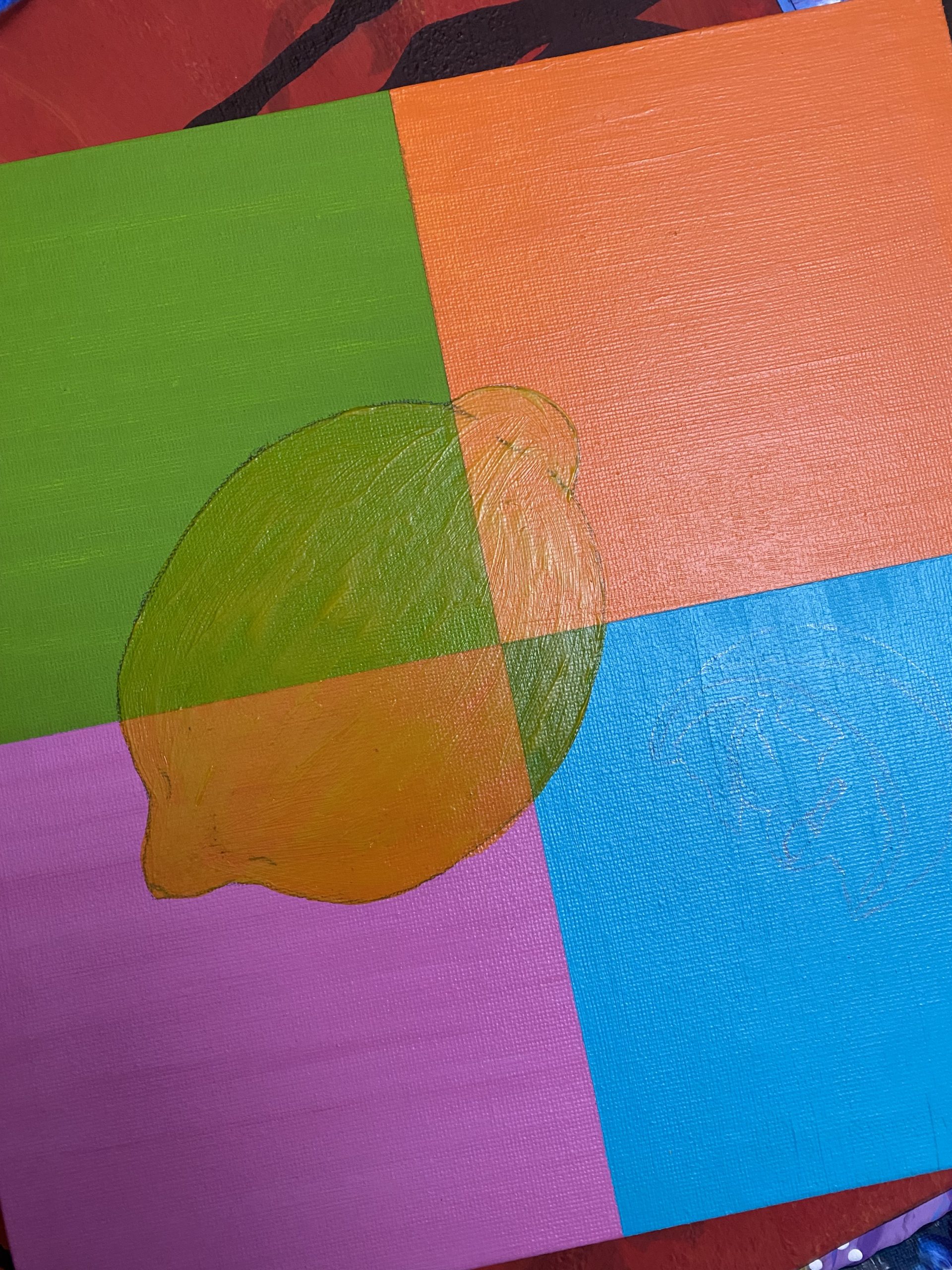
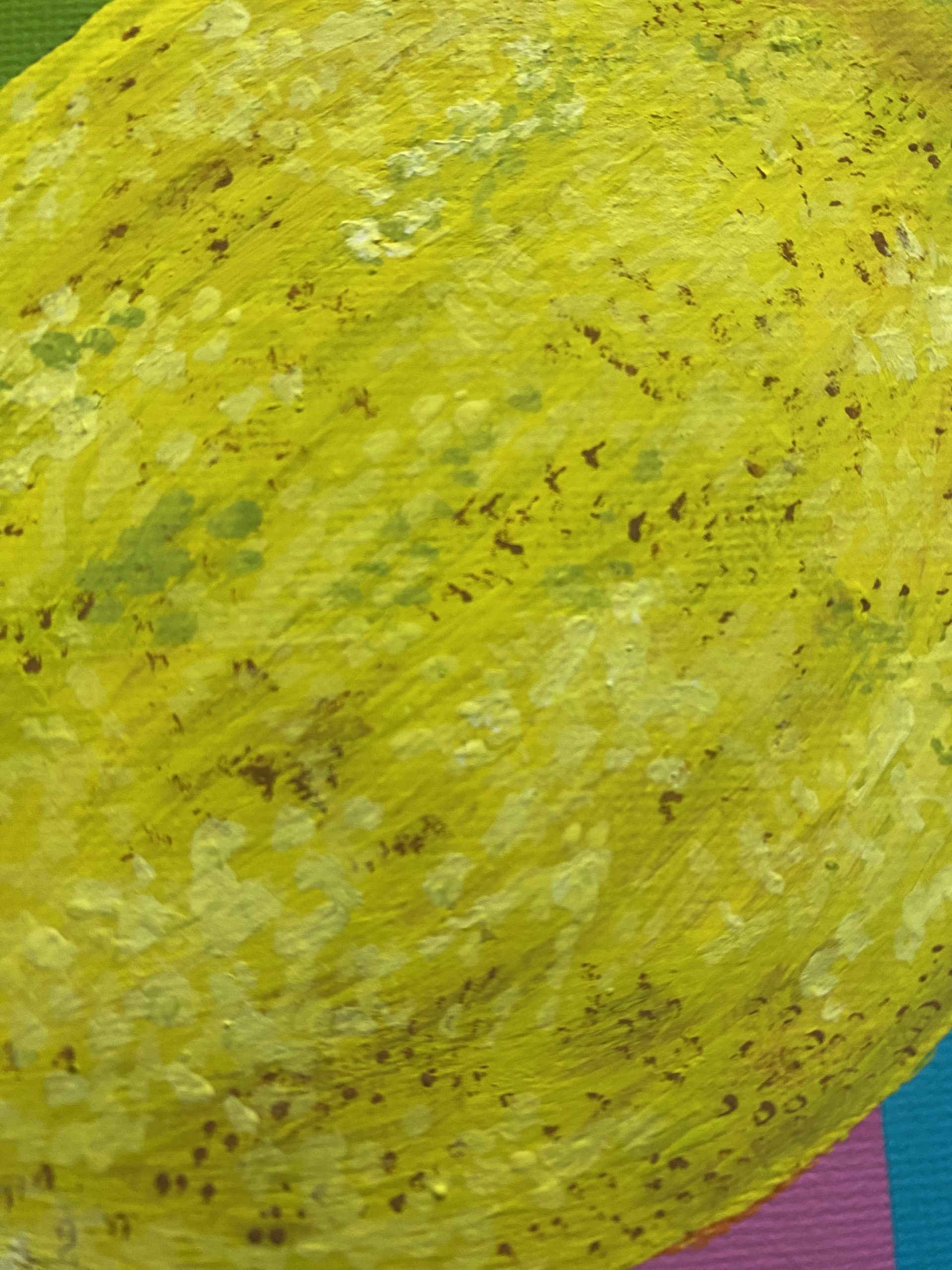
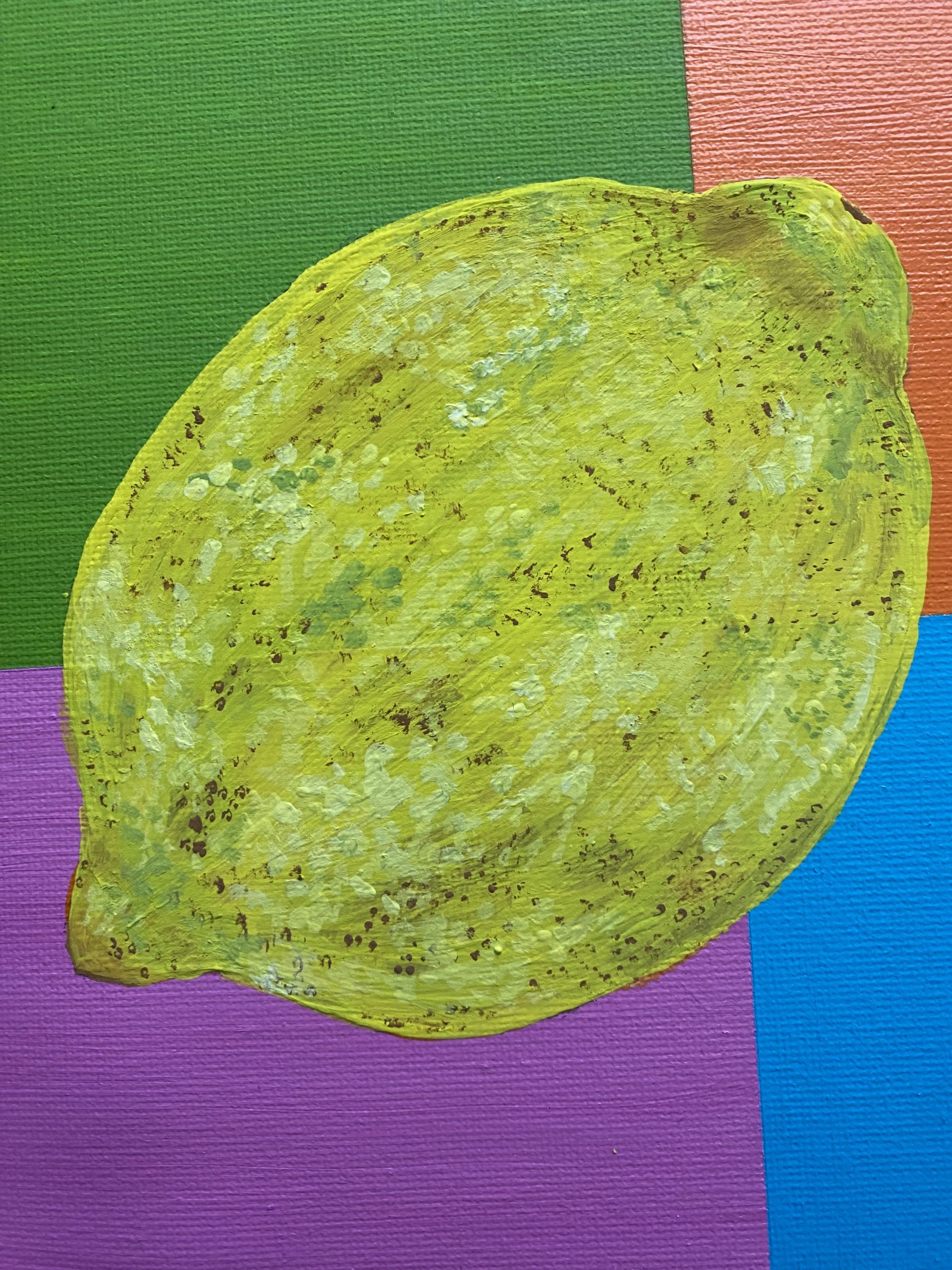
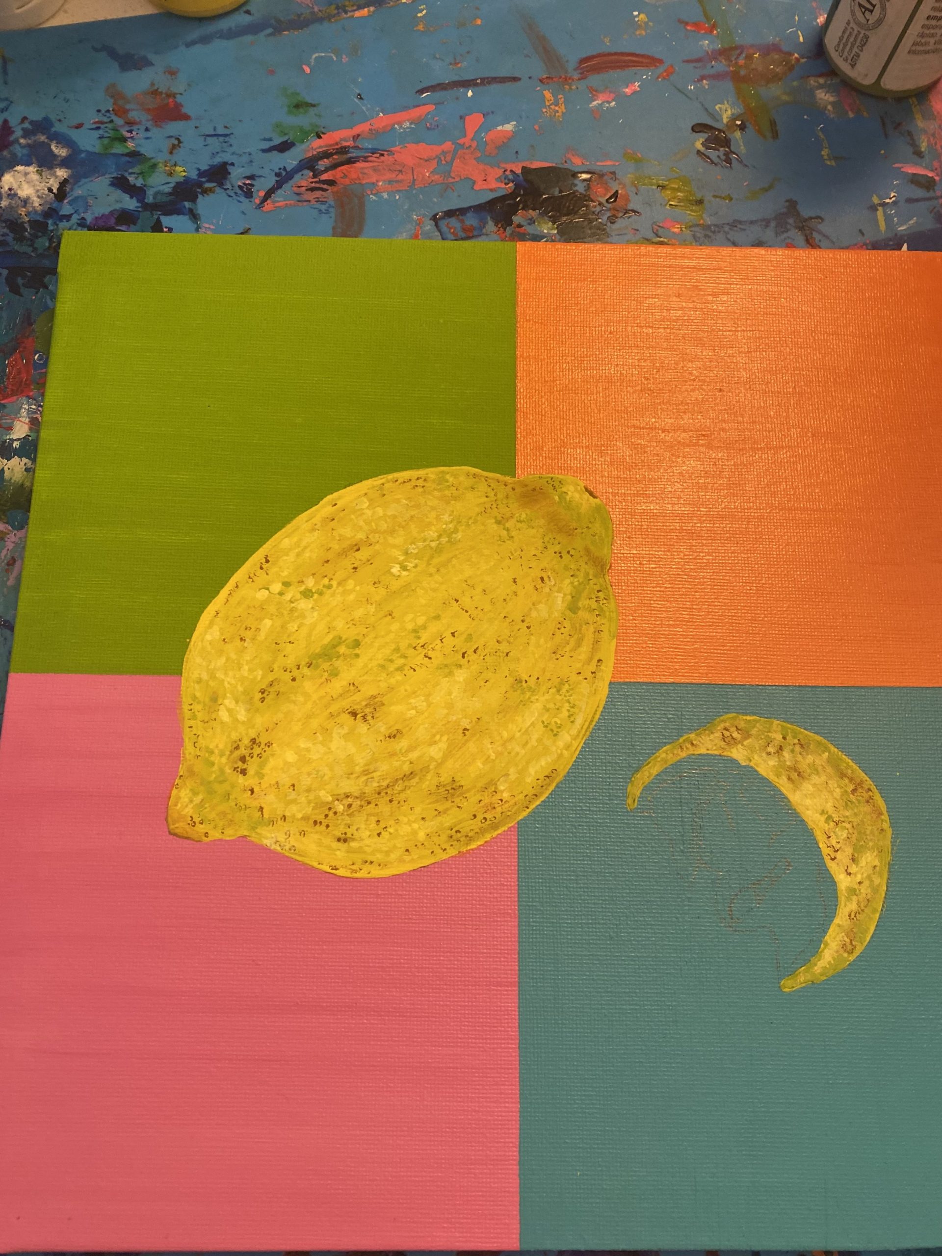
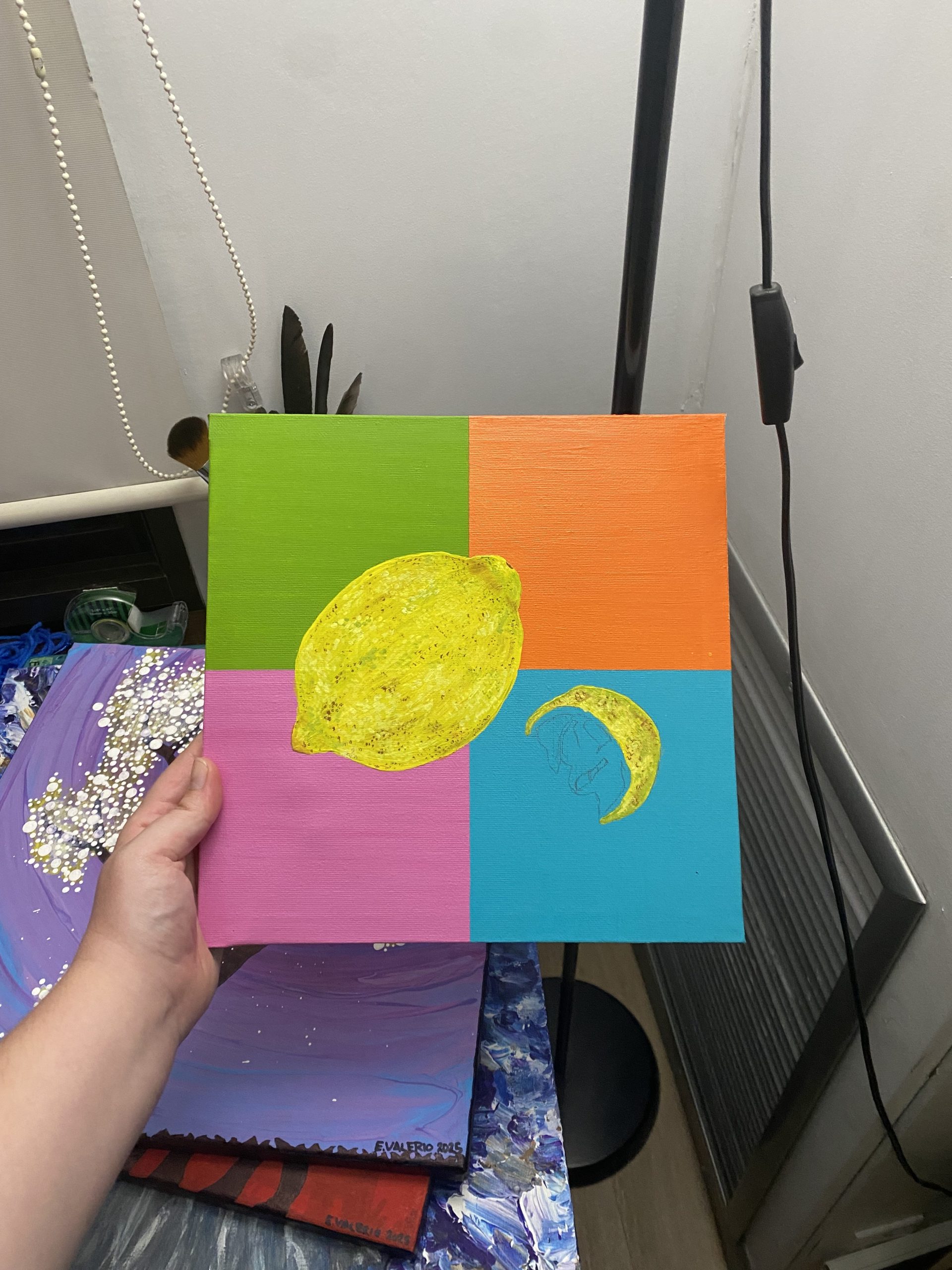
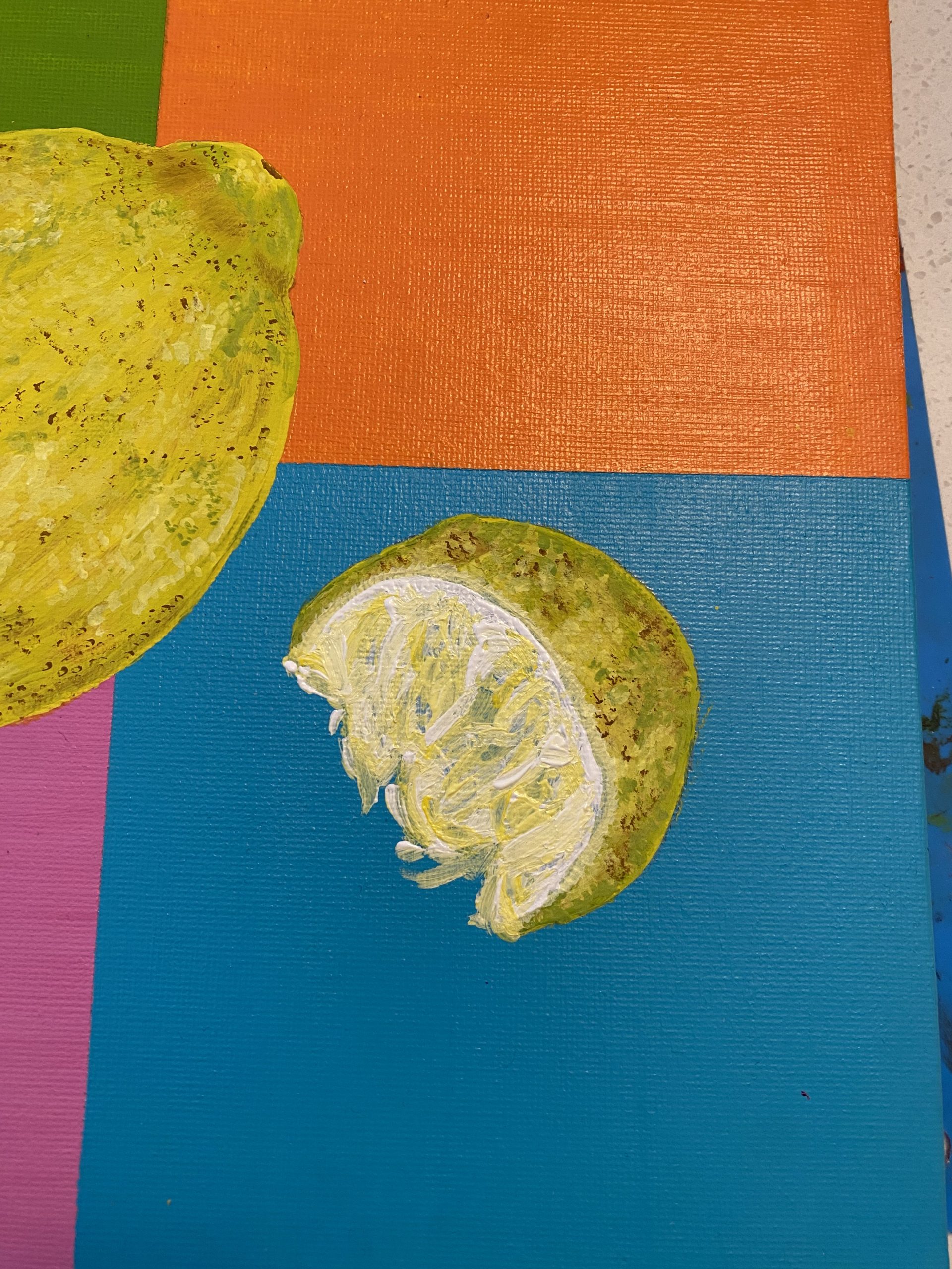
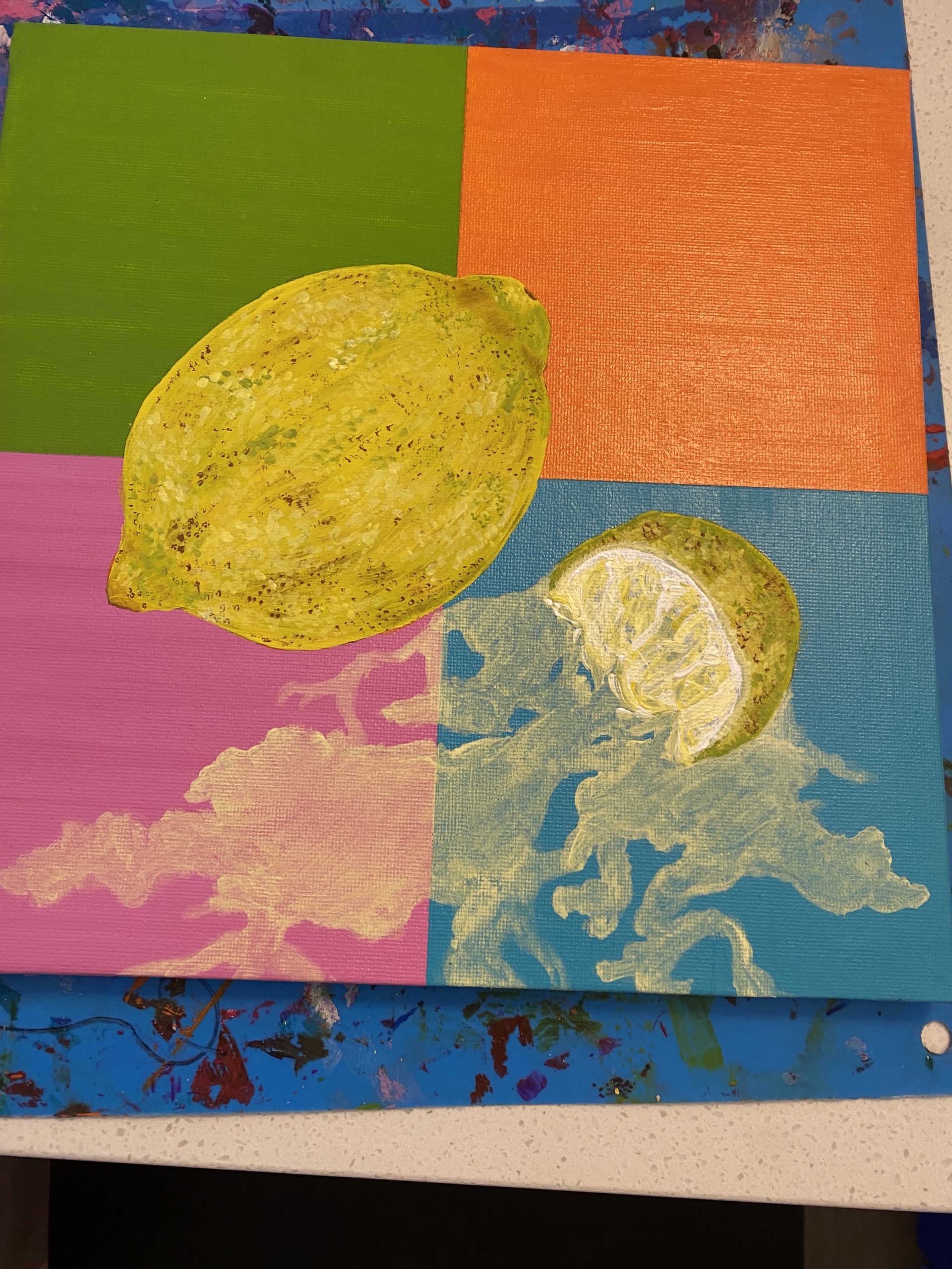
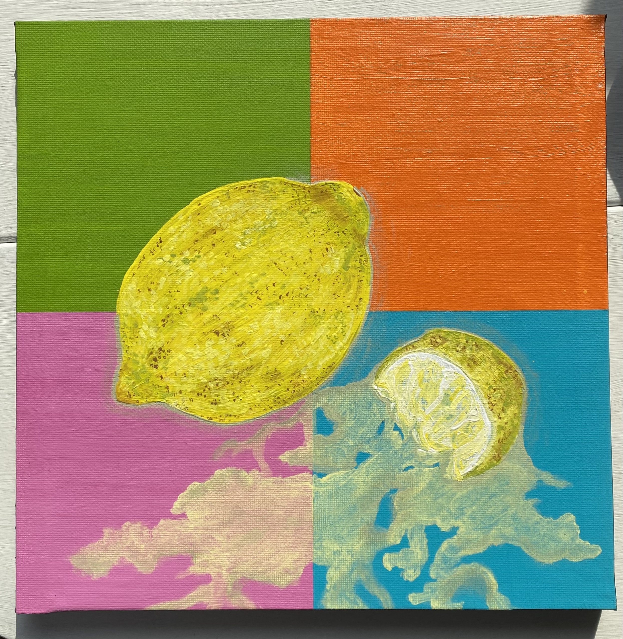
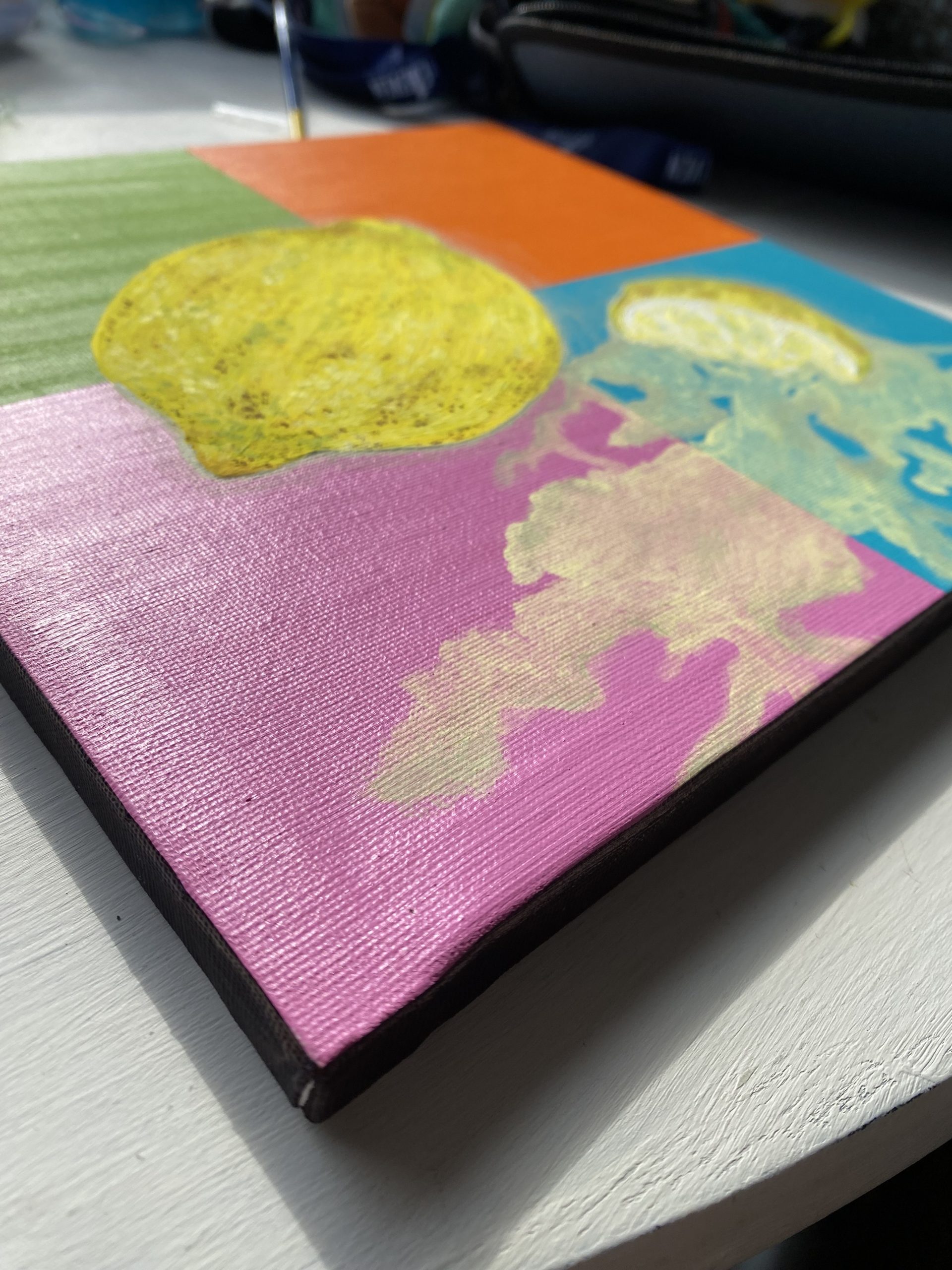
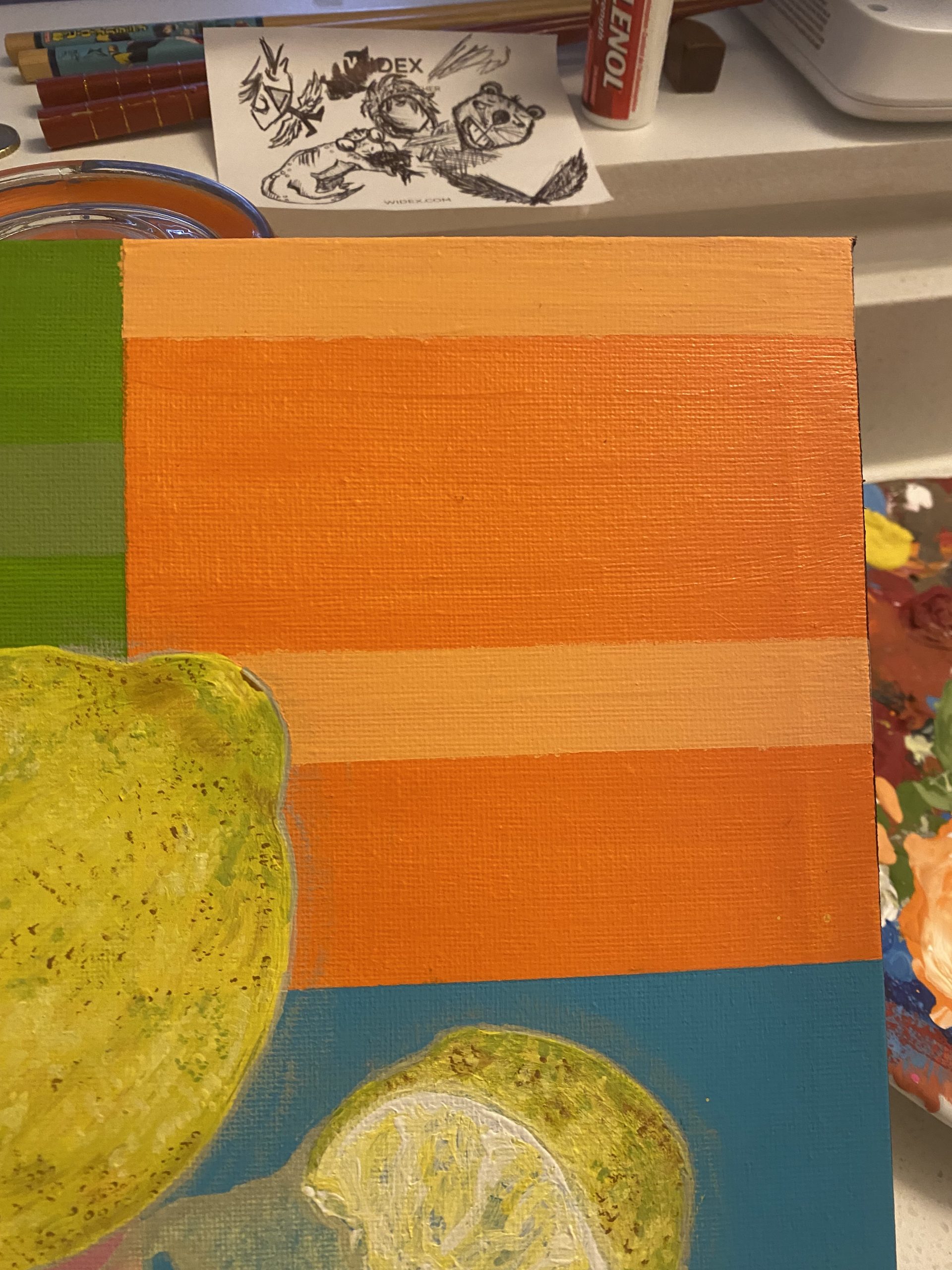
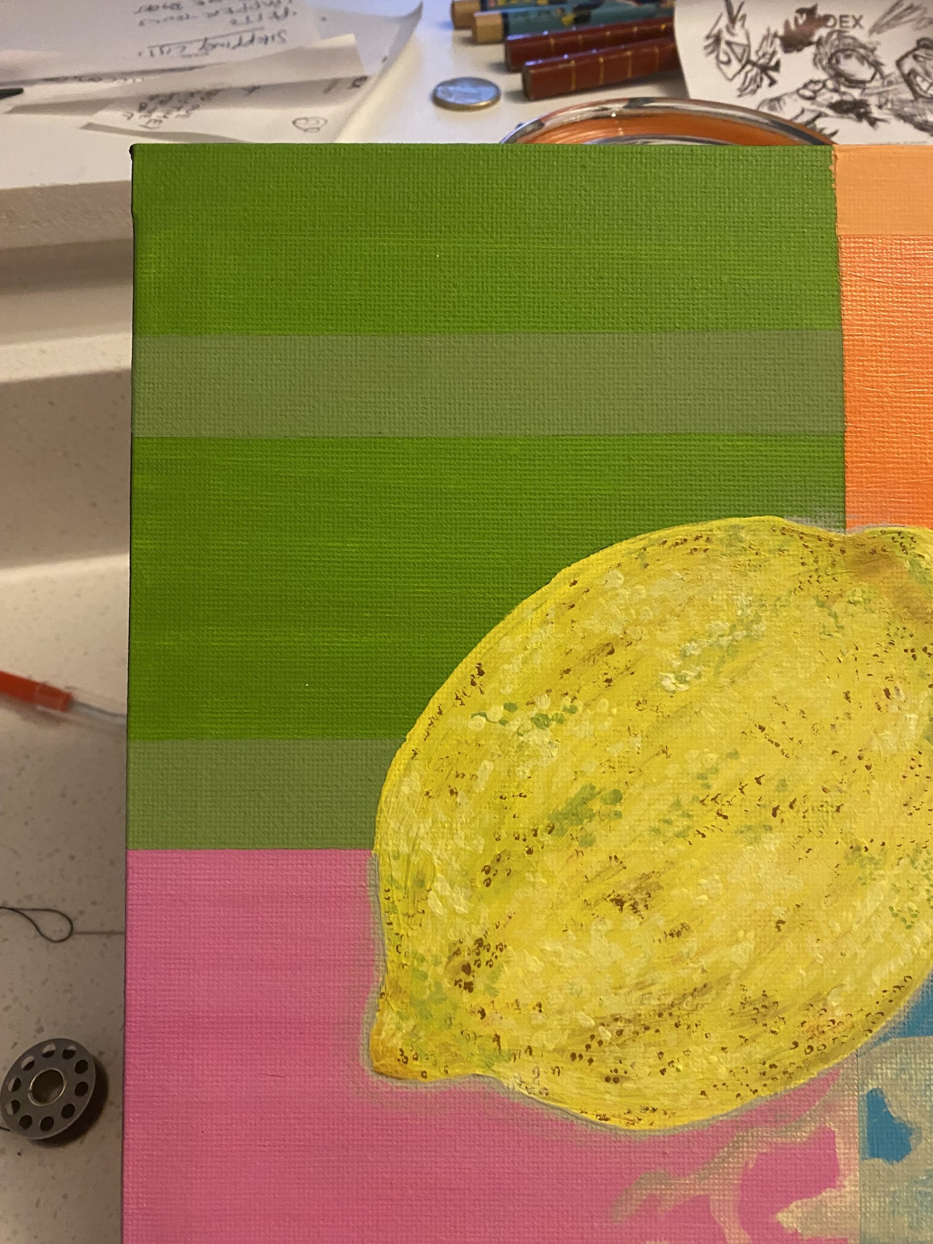
This last week I spent time at BEING studios working on a new artwork, That reflects how life gives you lemons and and sometimes then squeezes it in your eyes.

Several  big changes, and the loss of my dog a few weeks ago, all came at a point where It gave me the inspiration to paint something meaningful while achieving what I had set out to do the first time.  I hadn’t been able to achieve what I wanted in the first attempt, but now feel pleased I got to explore Pop Art and still and to have made this piece that is really authentic.

Sarah told me about a leadership theory called lemon leadership, interestingly, and one of the leadership styles in this model is the founder Brett Johnson saying that ‘there are leaders who shine light on things that they often think outside the box, but are likely to have challenges with practical implementation.’

These people are called Luminaries. A bit like me in some ways when I get sensory overload or life throws lemons and it all becomes too much. It draws attention/throws light on how I might need to change or other things around me might need to change too.

A Leadership Skill Is Knowing When To Pause

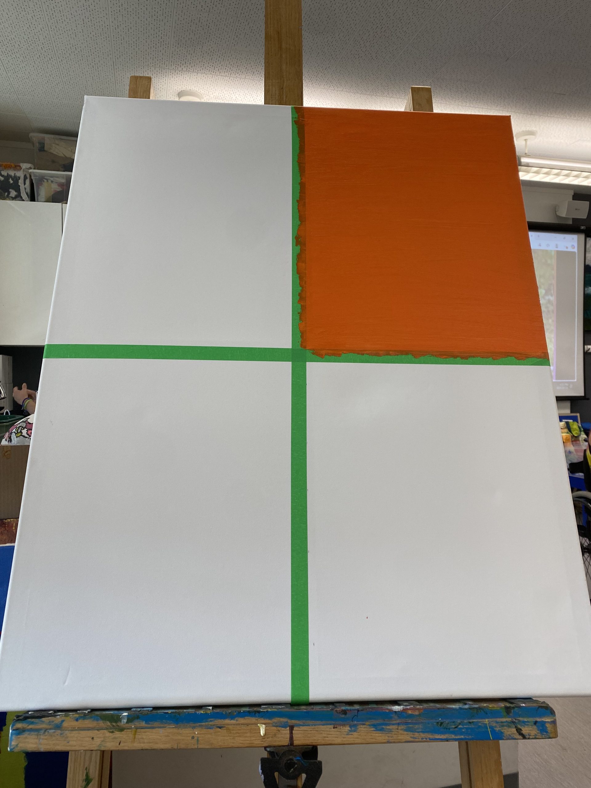
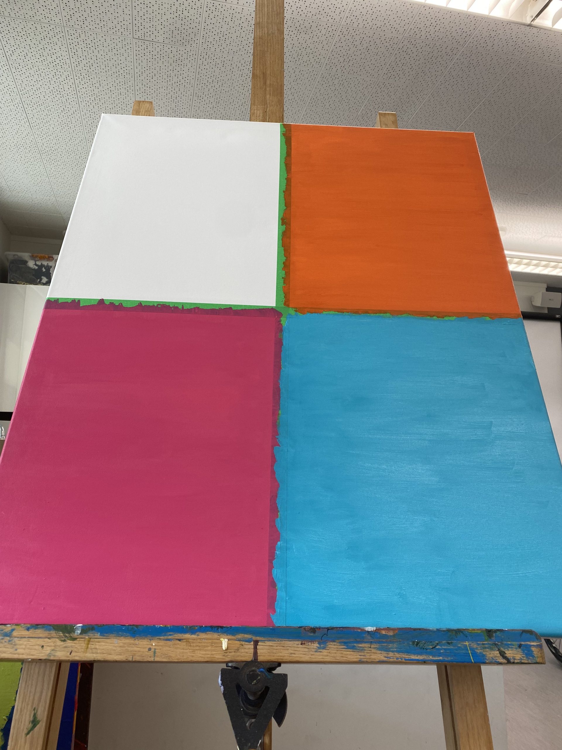
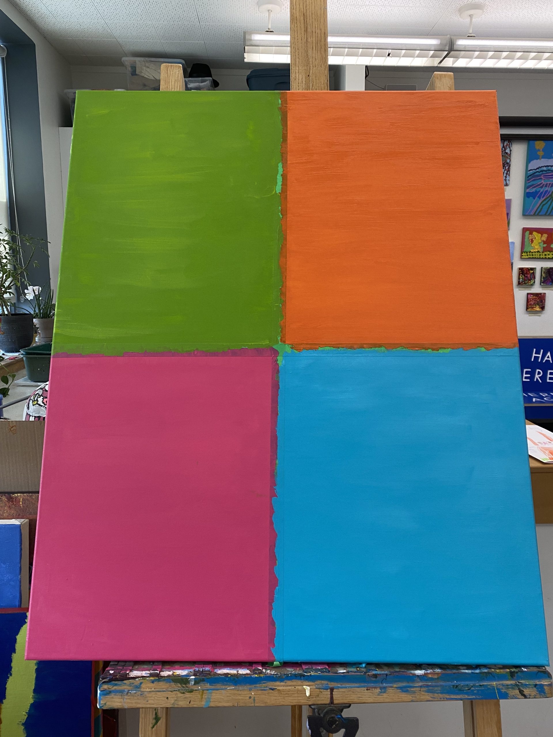
In Session five I explained to the group that I had wanted to be able to develop a painting in a similar style of Pop Art like the Andy Warhol paintings, and that I wanted to push my limits and try something new. I had been very much looking forward to shaping some iconic portraits to explore this style, combining it with my style, the Mona Lisa and The Lady With The Pearl Earring.

However life has thrown lemons in my face these last few weeks. and I made the decision that it was not the right time to bite off more than I can chew. So I put it on pause.

Often when I start on a project, I do it knowing that I have as much time as I want or even need to complete it.  And I don’t just use that time to paint, I use it to express what I’m feeling and be myself.

My leadership  comes from what I learn from pain and other life experiences. It helps me connect with people going through similar things an empathetic style and this is why when i’m working with and for others, I am able to be on their level and know how to help or guide them through things,  having already experienced it for myself and often doing it alone. So I would be able to share that it’s not a failure to pause, but be the responsible thing to do.

So I put this artwork on hold so I can now use the time I have, and the energy to make something smaller and more meaningful within the time I have. This doesn’t mean that I won’t spend time working on it or that I won’t finish it. But rather the time wasn’t and isn’t the right time to work on it and i’m OK with that.

A Rose Between Two Thorns

In Session 3 of our leadership program, we were asked to choose a metaphor. I chose “A rose Between Two Thorns” and drew the image on the iPad. For me the idea of being a rose between two thorns was something that my mum used to say to me. I always chose boys to be friends with when I was young, so I was naturally seen by people as the rose between two thorns.

The metaphor also allowed me to reflect my leadership style of being like a chameleon – Situational Leadership: In that way I adapt to the situations I find myself in. Posting things online, working with young people at camp or being around friends and family.

It made me think of all the different ways we have to adapt.  I’m also someone who is very affected by the environment around me. Sometimes thorns protect but sometimes the thorns of life can affect the way a rose is seen or held. Throughout the residency, I’ve been exploring Pop Art so I did many different versions of the rose! Red, Blue, Pink, Purple, Yellow and more.


Untitled Nature

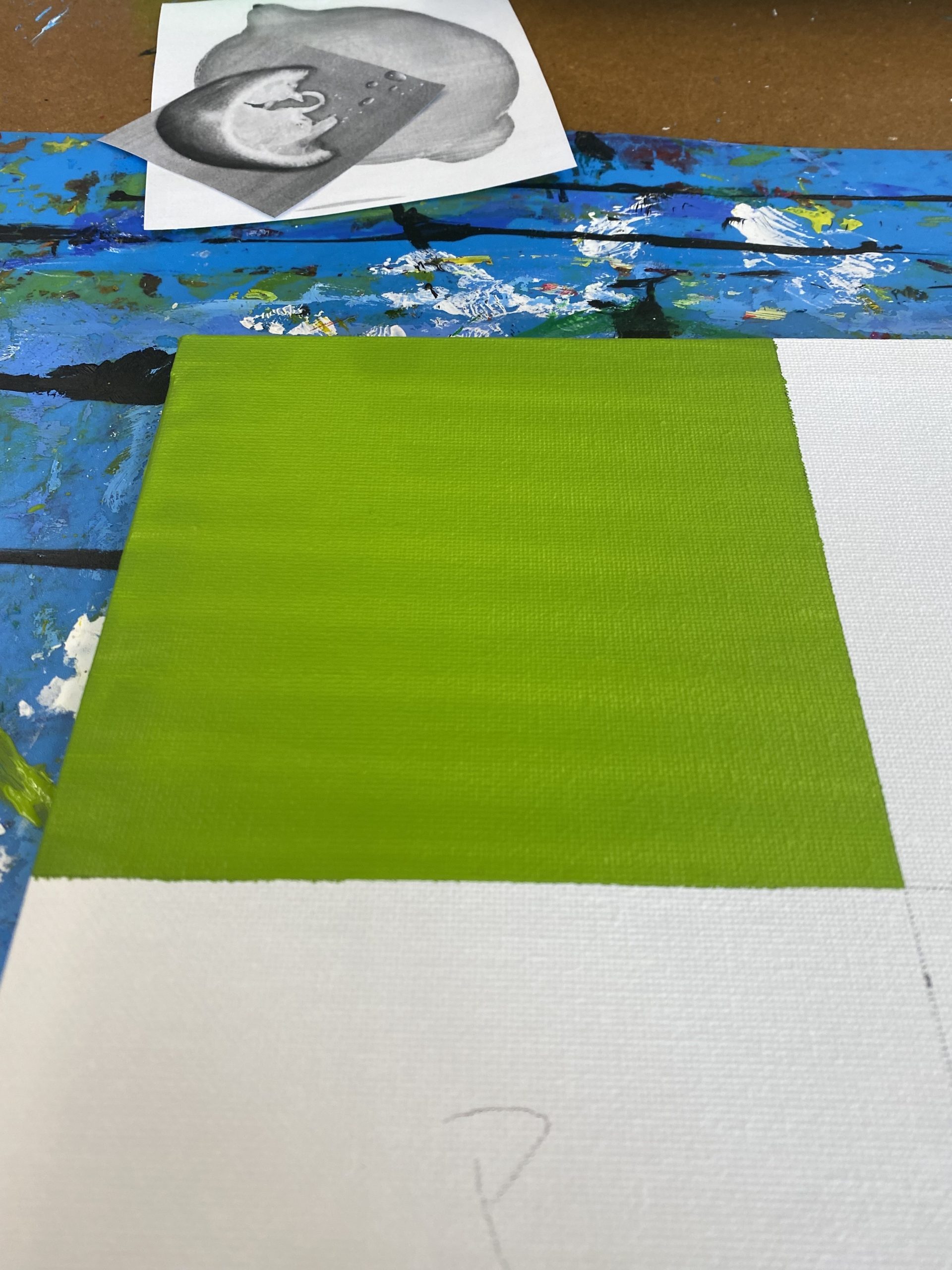
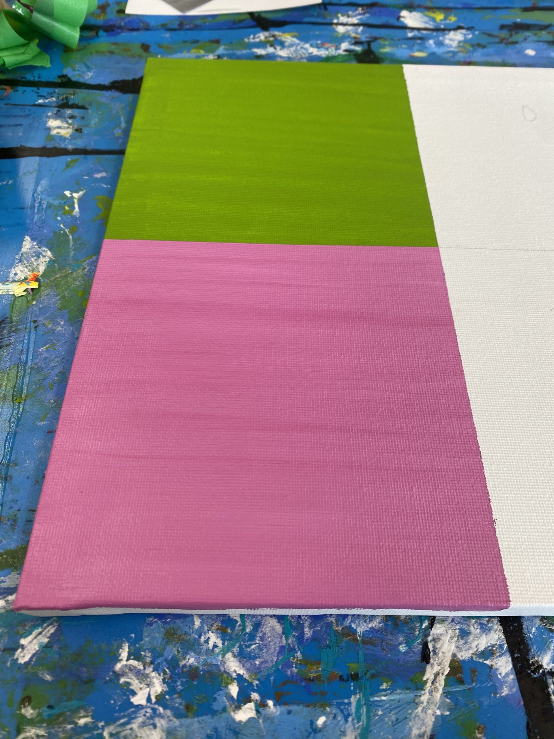
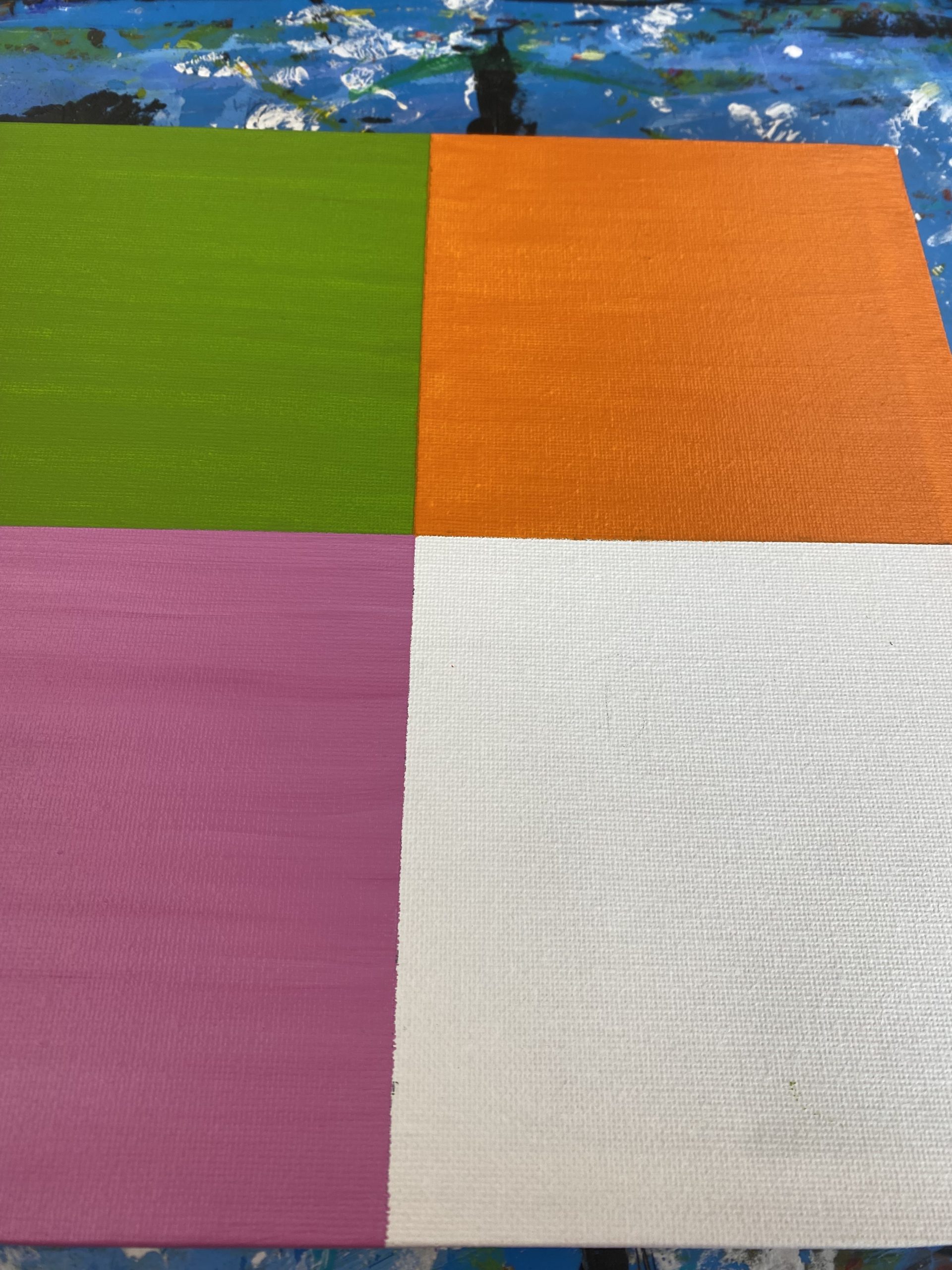
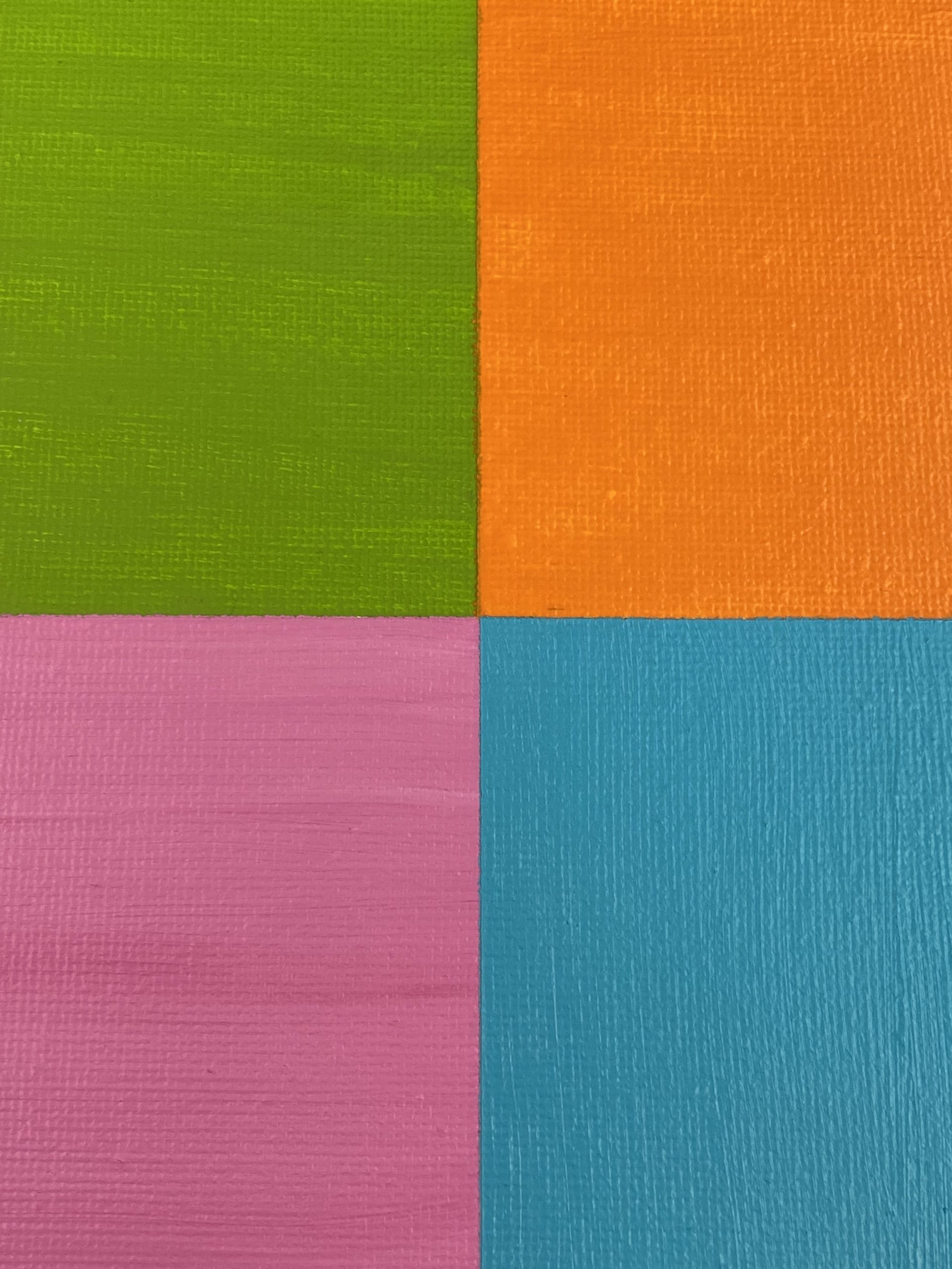
Untitled Nature: I went into this painting knowing how and what I was going to do. Usually or most of the time when I am doing a painting, I go into it with no idea what i’m doing or how to do it. Growing up I have always loved taking pictures of nature, so as I was looking threw some of my old photography photos from a couple of years ago I came across a few that I thought would make interesting paintings. A canvas painting of 4 images of nature in shades of green. Top left is a pink flower and a muffled background. Top right are a field of white daisies. Bottom left is pine trees angling up into the sky. And the top right are is looking down on lily pads with an over hang of bushes at the top. I’m not very good at painting up close and detailed landscape art so it was a bit of a challenge but I got it done and it turned out better then I thought it would.

Picture 2 description: Another view of the Untitled Nature painting, A canvas painting of 4 images of nature in shades of green. Top left is a pink flower and m muffled background. Top right are a field of white daisies. Bottom left is pine trees angling up into the sky. And the top right are is looking down on lily pads with an over hang of bushes at the top.

Picture 3,4,5 and 6: These are photos I took myself and used as a reference.

God’s Hands

God’s Hands: God’s Hands is a very special piece to me.

It holds both good and bad memories. It serves as a constant reminder of what should have been but never was. I grew up in a Christian household and had some encounters with God’s presence but never really understood how to hear him. It wasn’t till high school that I figured it all out and found my special way of hearing him. This painting is history and my Testimony. It’s my journey through and out of crippling depression.

I lived in Australia until the age of 14. When we moved, everything was all taken away from me, In what seems like a second. I didn’t quite understand that I wasn’t coming back. I remember not wanting to say a proper goodbye, back then I saw crying in front of people as a sign of weakness, I know now that it is more than OK to cry.

I remember looking out the window of the plane as we took off and watching everyone I had ever known slowly disappear and get smaller and smaller as we lifted off. The next five years were hard, constantly crying myself to sleep every night, and regretting never saying goodbye. For a while it was also fun being seen as something new and interesting to people, I felt special being the only Australian in the school. Everyone wanted to ask questions – though it did get a bit annoying at times – No, no one rides Kangaroos to school!

I was still carrying around a lot of hurt, changing schools, getting bullied, graduating and friendships on the rocks. I was starting to fall into a depressed state. I would come to school and spend time in the bathroom alone crying, my friends started disappearing during lunch and I spent most days alone. I eventually quit my job to stay focused on school and mending my relationships; it turns out when you cry a lot and it gets too much to bear alone, the natural response is to reach out to people you trust enough to help you, and that’s what I did.

I tried asking for help but no one would listen, I started getting more direct. Everyone I thought was a friend started abandoning me. They couldn’t handle me not being the happy bubbly person that spent every day helping them, making them laugh and cheering them up when they had their own problems and bad days. In days, I lost all my friends and spent lunch crying in the Tim Horton’s bathroom. I started rebelling in class – I went from being the teacher’s pet to being the class clown. I started skipping a few hours of class, then a whole class, two classes, half a day and eventually I stopped coming to school all together. I didn’t have anyone I could reach out to or talk to about it. Both my parents worked full time and my sisters were never really around much. I was spending all day in bed sleeping. After a while I made the decision to try college.

Let’s just say that had all whole other set of problems. Everyday I felt like I was looking through a narrow dark pipe. like I was constantly drowning. If rock bottom had a basement, that’s where I was. I was so far under that no one could of helped, it was all on me to pull myself back up.

When you feel as low as that all the time, your mind feels like it’s never clear enough to think straight. At that time I was listening to a lot of Christian music. I remember a particular day I wasn’t feeling like I… in nicer ways to put it… wasn’t wanting to not exist in this world anymore, I just wanted the pain and hurt to leave me alone, so I could take a breath. My head felt so heavy that day I even stopped looking when I was crossing roads. I remember listening to the song “Reckless Love” by Cory Asbury. as I walked down the road to the college, God flashed a very vivid image in my head, it was almost like I was standing there looking at it in front of me.

I knew that I had to paint it.

I went home that day, Dad approached me and said “I’ve signed us up to go to camp and paint in front of people, start thinking about what your going to do”. I knew exactly what I needed to do.

In my head I saw these big hands and arms reaching down, the hands looked strong, but soft. And it was every skin tone that we are aware of and more – like it was all swirling around as individual colors but somehow blended perfectly into one color. like I knew it was all kinds of colors but it was also a whole other color all of it’s own. The hands where reaching down like they were picking something up. And when you looked down, it was a small child curled up in a ball in the darkness. the hands were sending out this bright light piercing the dark.

Unfortunately I was on a three day schedule to get it finished, and my canvas was not big enough to support the whole thing. I spent those three days painting to the best of my ability what I saw in my head that day. On the last day when It was finished I shared the story of the day I got the image in my head and explained what it meant and what it was about in front of one hundred and sixty people.

From there doors started opening for me.

I got to join an amazing studio to spend my time painting how I want when I want. And it led me to this opportunity to join the Sync space program. after experiencing all of that. It was like I could see colors in places I wasn’t able to before.

I started Cosplaying and using my artistic skills to bring characters to life. I have met so many supportive people online and in person these last few years. Life has thrown some pretty awful things at me these past few weeks and especially the last few days (like having to put down the family dog/ my best friend down). Am I sad? Very much, but I will never end up in such a low place like that ever again. It feels as if now that I have experienced that, the bar of where rock bottom seemed to be before has moved up or gotten smaller. as if I will never feel that low ever again.

So to anyone reading this, If you ever fall as low as I have, just know both you and myself are not the only ones to experience that pain. And if you do reach that basement of darkness, just know that pulling yourself out is not easy and it might even take a year or so, but when you’re able to climb out and breath again, that dark hole you were just in will never feel that deep ever again.

I don’t want to be one of those people that says it gets easier, because if I’m being honest, it never gets easier, life will ALWAYS find something to throw at you, life’s lemons might even get squeezed in your eyes a few times (Slight foreshadowing for an upcoming painting), BUT IT WILL BECOME MORE MANAGEABLE EVERY TIME. HANG IN THERE!!!

Togetherness

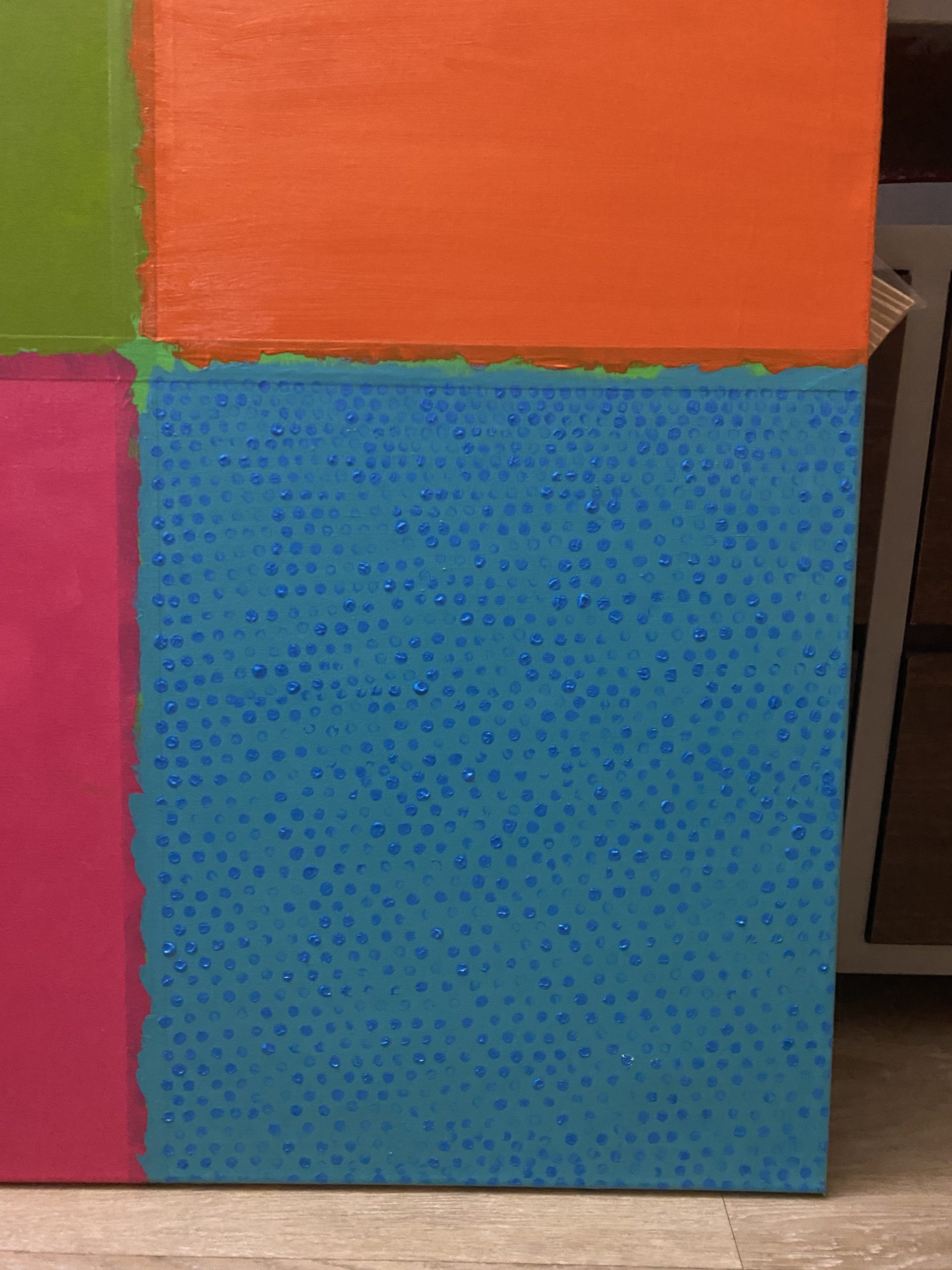
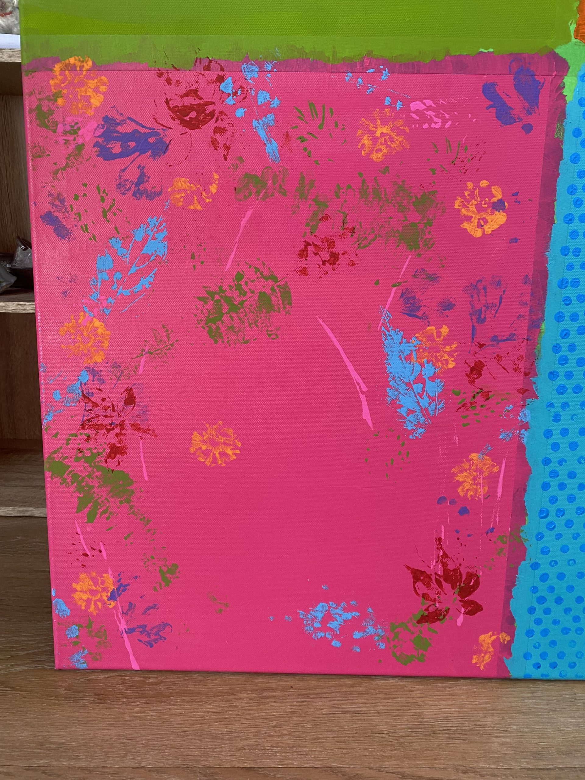
Togetherness: This was an interesting project. It started as some shapes I saw on a piece of paper, I sketched it out and has the Idea on what to do next and what it will represent. this piece represents INCLUSION and promotes anti-racism. it reflects people of color and race taking back power. this painting is also like a double edged sword. while it represents different people of color and race taking back power it ALSO represents how different the world would be if we all put aside our differences and judgment  on others. HARMONY and PEACE.

Description and Explanation: This painting is split into four boxes leaving enough room between each box and the sides of the canvas to create a border. at all four sides of the canvases are small squares. The top right and bottom left squares are orange and the top left and bottom right are left blank. inside box one, top left: Horizontal teardrop like squiggles going down, separated into two shades. left white and right black. Top right: This one requires a lot of imagination, to me it looks like an unintentionally made man but to others it might just looks like a bunch of crazy squiggly lines, or something else entirely. imagine closing your eyes and making random squiggly lines, then filling each of those gapes in with a different color, making sure the same color doesn’t sit next to itself in another space. That’s pretty much the idea of it anyway. Bottom left: It’s the same as the first one except this time the squiggles are horizontal and the top color is yellow and the bottom is red. The final box, bottom right: is two people lying down on each others shoulder. The background is grey, the person on the left is painted black and the person on the right is painted white.

Pride

Pride: I was inspired by the LGBTQ community for this one. It is resembles ACCEPTANCE and SELF DISCOVERY (Identity).

Description: The border of the painting is the pride flag. The top is a downwards facing triangle layering the colors from middle to sides. White, light pink, light blue, brown and black. underneath the triangle is vertical stripes from left to right using the colors. Purple, dark blue, green, yellow, orange, red. in the center of the canvas is a big grey oval with different pasterns and colors, bubble wrap pattern in red, finger prints and scribbles orange, paint flicks dark blue and feathers green. and in the middle of all that chaos sits two transparent head to shoulder silhouettes of a girl and a boy, painted using thinned out black paint, and the bottom half of them faded and dripped out disappearing into the page.

Picture 2 Description: In the center of the a blank canvas is a big grey oval with different pasterns and colors, bubble wrap pattern in red, finger prints and scribbles orange, paint flicks dark blue and feathers green.

Picture 3 Description: The border of the painting is the pride flag. The top is a downwards facing triangle layering the colors from middle to sides. White, light pink, light blue, brown and black. underneath the triangle is vertical stripes from left to right using the colors. Purple, dark blue, green, yellow, orange, red. in the center of the canvas is a big grey oval with different pasterns and colors, bubble wrap pattern in red, finger prints and scribbles orange, paint flicks dark blue and feathers green.

Picture 4 Description: The border of the painting is the pride flag. The top is a downwards facing triangle layering the colors from middle to sides. White, light pink, light blue, brown and black. underneath the triangle is vertical stripes from left to right using the colors. Purple, dark blue, green, yellow, orange, red. in the center of the canvas is a big grey oval with different pasterns and colors, bubble wrap pattern in red, finger prints and scribbles orange, paint flicks dark blue and feathers green. Edge of the painting is lined with black lines.

Bubble Tree

Bubble Tree: This was one of Eleven series paintings I did for an exhibition at the “Bite Burger House” restaurant in Ottawa  for a few months. it’s current location is on my wall in my apartment. This was one of two of my favorites. The reason I decided to paint Such a unique Tree: I am raising money for a missions trip to Africa for the Sawubona Projects. The Sawubona Projects helps young girls and women learn how to do things like sewing, crafts, cooking etc. The tree trunk was made using permanent marker. and the leaves were made by mixing yellow paint, soap and water. I then used a straw to blow bubbles and scooped it with a spoon and placed them down on the page. once dry I took the end of my paint brush and dipped it in white paint and carefully followed the patterns of the bubbles. This was an interesting concept for me. unfortunately what I was going for with the bubbles didn’t turn out how I saw it in my head, once I experimented with the white paint I was supersized at how it turned out.

Description and Explanation: The background is dark purple going into light purple and finally blue, painted in a circular motion to represent the sun and sky. Right in the center of the painting stands a tall tree. The leaves are small white dots imitating bubbles. under the white bubbles is a thin layer of yellow paint mixed with dish soap and water, then blown on using a straw. This painting took a dramatic change when I finished it and decided I didn’t like the end results and ultimately changing it completely. it went from a solid orange painting with an elephant and a tree, to a bright purple with an extravagant tree in the center. I was attempting to break the laws of art by blowing the acrylic paint on with a straw, similar to what can be done using water color.

Second Image Description and Explanation: Orange background painted in a circular motion. big tree on the left and side profile of an elephant on the right and a couple of small birds sitting on it’s butt and one flying above it’s head. This painting took a dramatic change when I finished it and decided I didn’t like the end results and ultimately changing it completely.

African Safari

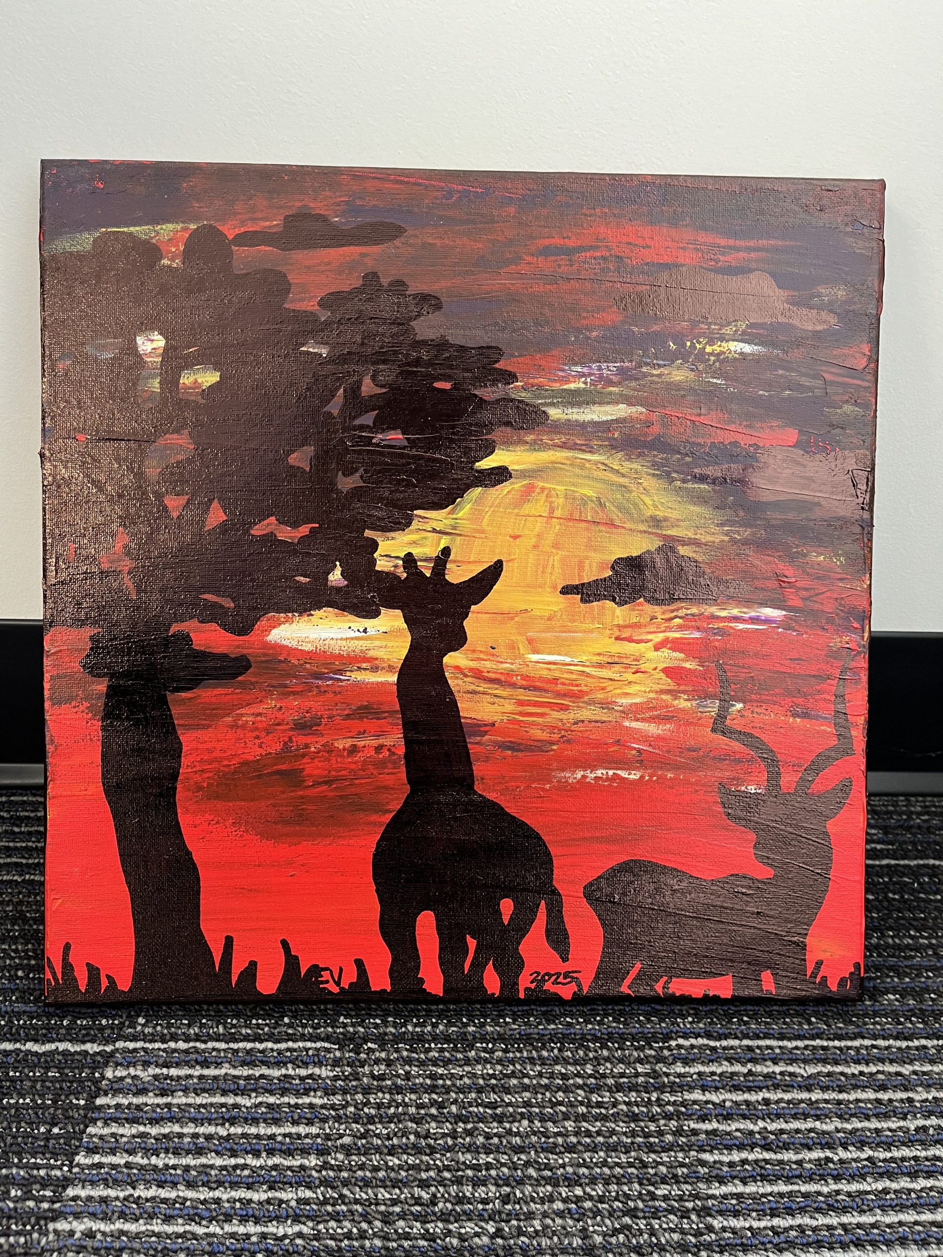
African Safari: This was one of Eleven series paintings I did for an exhibition at the “Bite Burger House” restaurant in Ottawa  for a few months. it’s current location is on my wall in my apartment. This was one of two of my favorites. The reason I decided to paint Giraffes: I am raising money for a missions trip to Africa for the Sawubona Projects. The Sawubona Projects helps young girls and women learn how to do things like sewing, crafts, cooking etc. The Giraffe’s, Trees, Antelope and clouds were all made using permanent marker. In the distance you can see the small Giraffe, Antelope and tree. These were part of the Original painting. I didn’t like how small and stubby the Giraffe was compared to the tree and Antelope, it was size inaccurate. I painted over it twice thinking the marker would disappear and I could reset. This turned out not to be true. I just kept going for fun thinking I could always scrap it and do another one. I underestimated the power of paint and skill. It turned out extremely well and I am not just proud of this piece but extremely happy on how it came out. Not only dose the Giraffe in the back look like it’s in the distance but next to the other one it looks like a baby. It worked out in the end, so my advice to any artist is just keep going, trust the process and it will all work out in the end.

First painting description: Bright yellow sun slowly fading into orange and red blending seamlessly in a circular motion. In the background of the piece on the left hand side is a fluffy like tree. Next to the first tree is a small short legged stubby giraffe, and antelope on the right. In the foreground of the painting over the top of the first tree is a tall leafless tree and standing next to it facing the tree is a tall giraffe.

Second image description and explanation: This was the original painting. It is an acrylic painting. It has a tree on the left hand side of the canvas. Standing next to it is an extremely stubby, short giraffe. next to the giraffe is an antelope. behind them is a sunset. I didn’t like how it turned out so i painted over it, witch is what you see in the first painting. Because the tree, antelope and giraffe where made using permanent marker, when I layered it with paint on top, even after painting it twice, the marker showed threw. I didn’t enjoy that idea but kept going anyway. In the end it gives the illusion that there are things in the background.

Emu Painting

Listen:

Emu Painting: I did this painting back in 2022 just before I graduated from High School. I decided to paint an Emu for a few reasons. The first reason is because I am Australian. I lived in Australia until the age of 14. I was missing home and felt nostalgic when in 9th grade I met my friend of 8 years now. when we met she gave me the nick name Emu because my name starts with Em and given my Australian background she thought it was a fun nickname. after awhile the other people I had become friends with started calling me that too, by the time I had graduated even the teachers called me Emu. I knew once I left High School there was a possibility that the nickname she had given me would most likely not be used by most people in the future. I had grown attached to the name and wanted a way to remember my days in School and my home country.

Painting description and small facts: This is a painting of an Emu. Emu’s are one of Australia’s native animals. Emu’s are large flightless birds. The painting depicts what an Emu typically looks like. Soft, shaggy, grey feathers. an Emu has a variety of color ranging from brown, grey, blond and occasionally white seen in an albino. They have a long neck and long legs. In this painting only his head to just to the top of his chest can be seen. Emu’s typically have yellowish- brown eyes or sometimes black. due to the high pigment in their eyes it can sometimes be seen as red, like what you see here in the painting. Some Emu’s, typically the blond or albino ones can be seen with blue eyes. Emu’s are the second tallest bird in the world, they can grow up to 6.2 feet tall. They are known for being the second fastest bird on land, with speeds reaching 31 mph or 50 km/hr. In this painting he has a big beak/bill and crazy looking feathers. his feathers where made using grey, black and white. Just under the shadow of the bill is a tint of blue. Some Emu’s have a distinct blue on their skin around the neck and sides of the head. The background of the painting is a multi color, consisting of light blue, dark blue, light purple’s, dark purple’s, white, and orange. the outline of the Emu is black gradually softening into a dark grey.


Choices and Fears

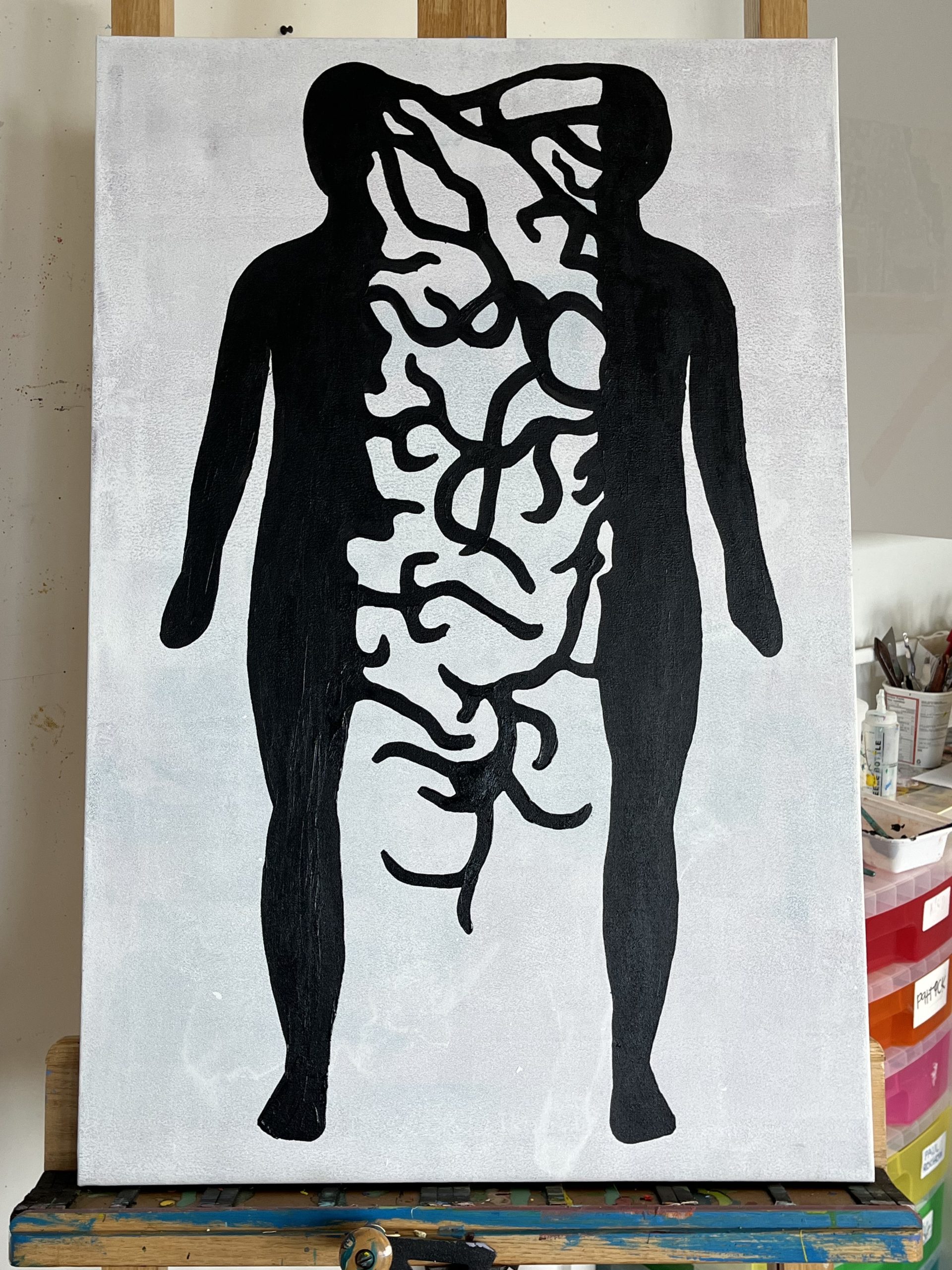
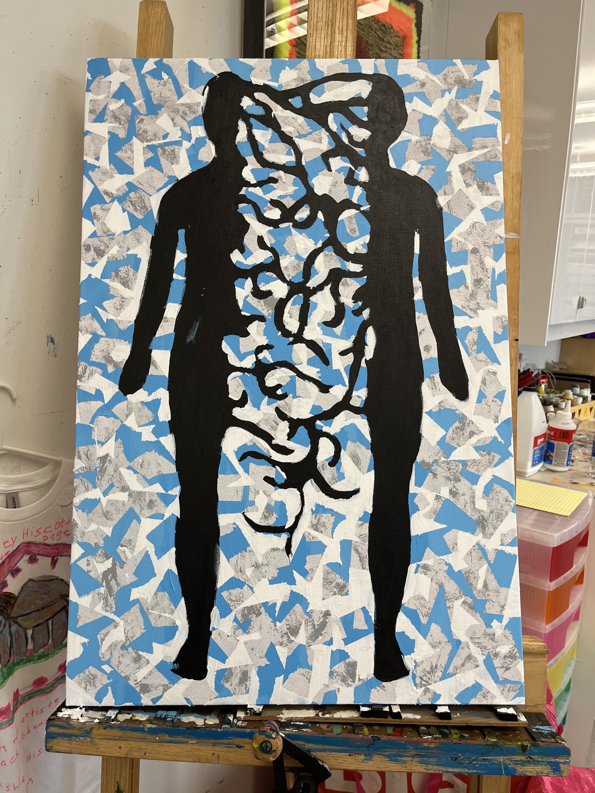
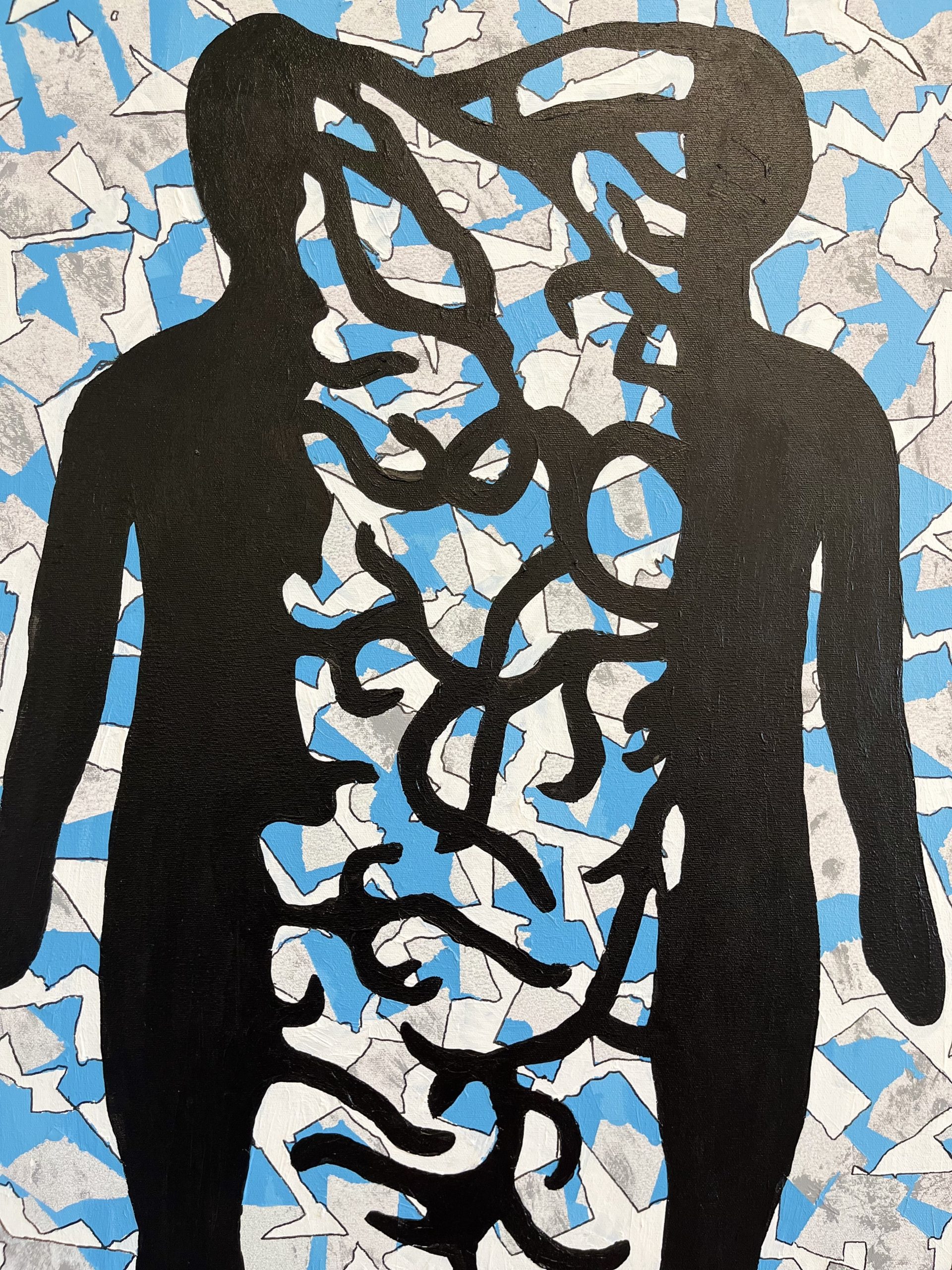
Choices and Fears: It has a different meaning for everyone. But for me, it’s a reflection of what it’s like being diagnosed and living with Autism, Anxiety and Depression. It’s also represents discovery of identity.

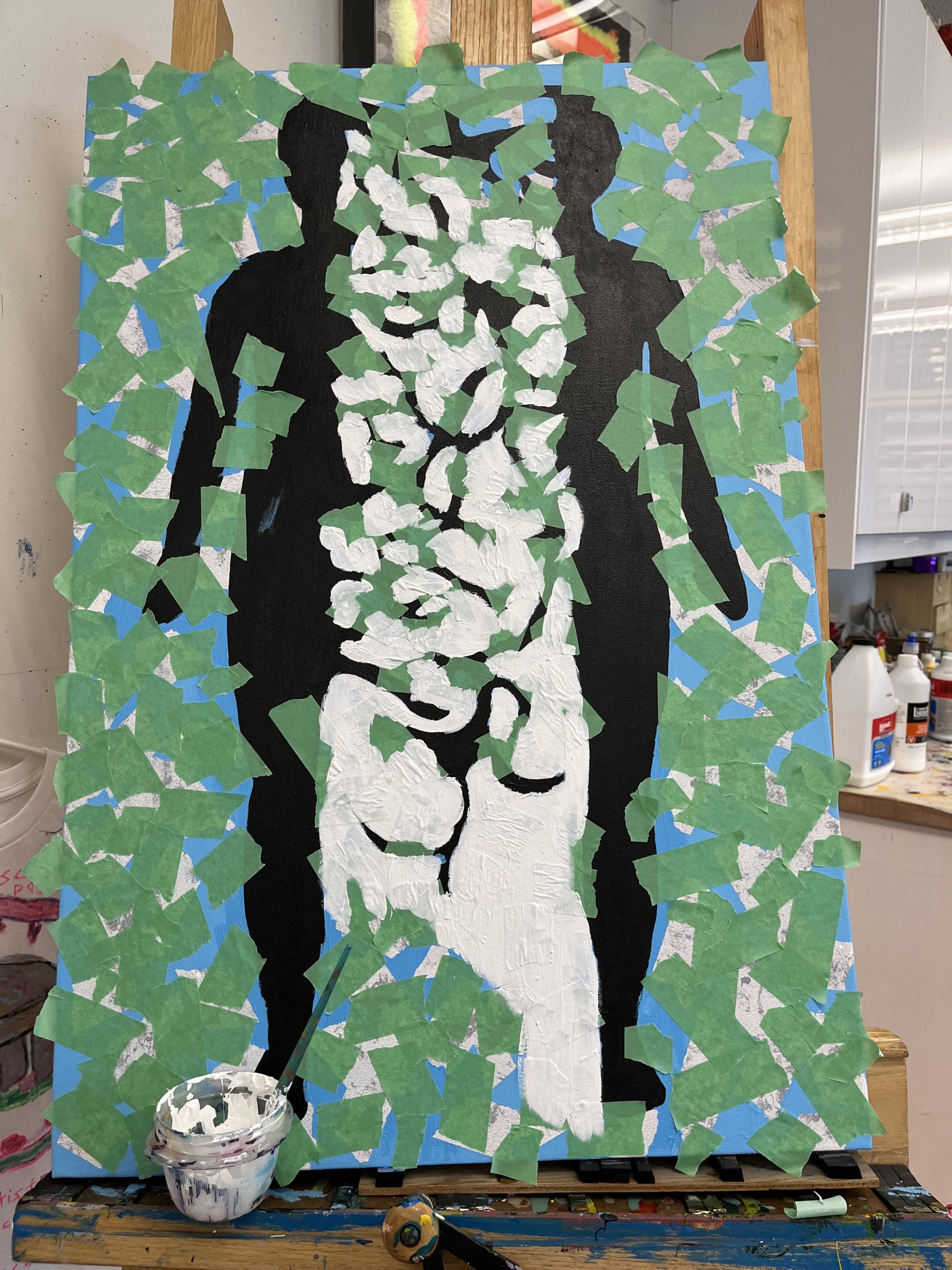
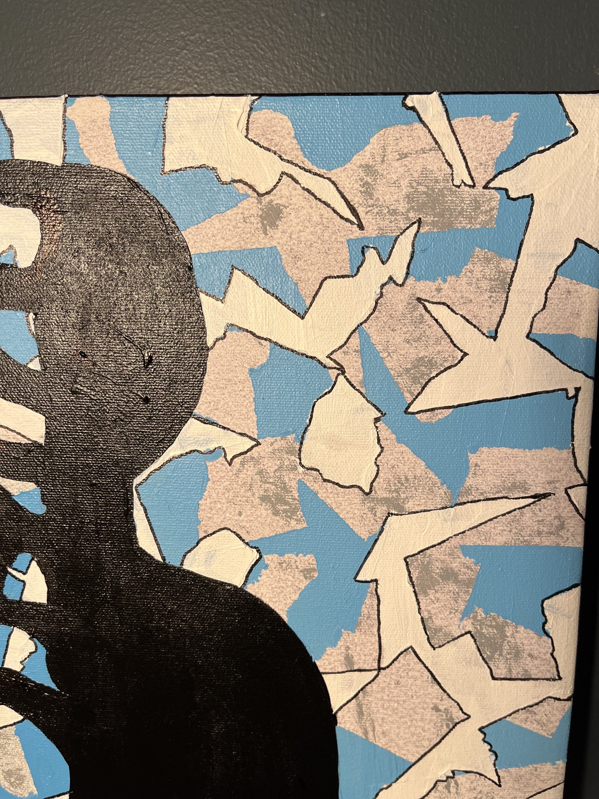
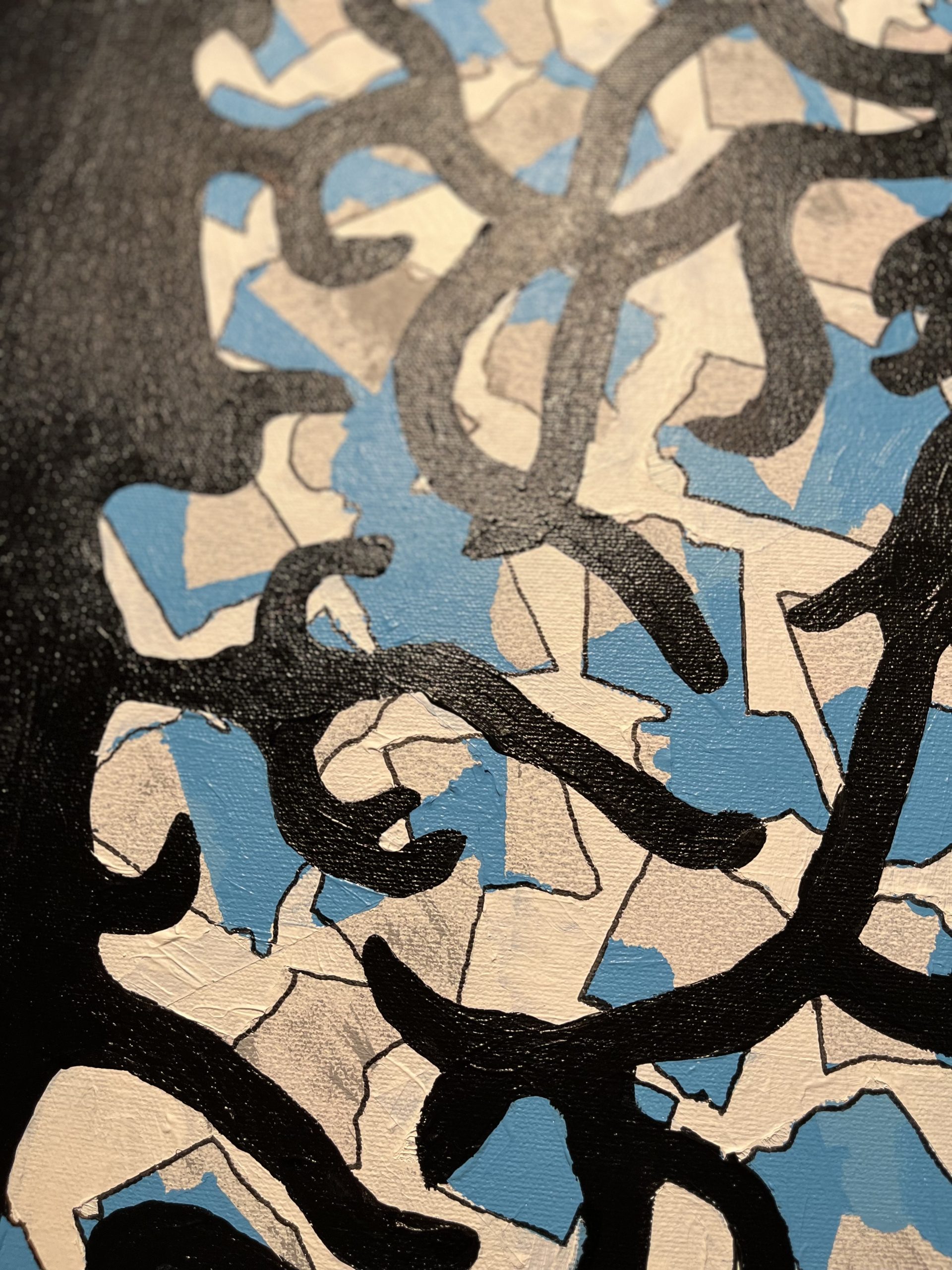
Description and Explanation: I found a template of a person and cut it in half. I then placed the two half’s where I wanted it and traced the outline. Once I made the outline of the person I spent time carefully figuring out where I wanted to place the lines/ bridge between the two half’s. I painted it black and waited for it to dry. I then got started on the background. The background is a combination of white, blue and grey. I started off by creating a marble like base using light and dark grays. Once that had dried I then tore up bits of tape and placed it in random spots and layered light blue over the top, and when that had dried I removed the tape and did the same thing once again, this time making sure the tape would cover some of the blue and grey, and covered the rest with white. When I had completed that I took off the tape and cleaned up the edges of the person. This took a total of six weeks to complete. The grey represents the feeling of disassociation and loneliness you feel when you only see the world as grey, when you feel like your so far down in the dark it feels like there is no way out. and the blue is a representation of depression itself.

Welcome to my studio – Emilia Valerio

This intro film shares artwork from Emilia Valerio and imagery and film of them giving talks and introducing and sharing their artwork to audiences live and online.

Read more about Emilia Valerio